Built for Mobile
Built for Mobile
Did you know that for the first time last year, more than half of all sales on our e-commerce platform came from mobile devices? (You can read more about that here)
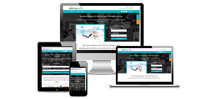
EVERY website we build is “responsive”.
I want a mobile friendly website
[hr]
What does ‘responsive’ mean?
Simply put, with a responsive design you do not need a separate mobile site. Your pages will automatically adapt, resizing themselves and their content to suit your customers screen size.
[hr]
We make sure:
- A visitor using a mobile phone should never have to zoom in or out to read text on your site: it will be clearly optimised for mobile reading
- No left or right scrolling. Mobile visitors are familiar with scrolling vertically through pages – having to scroll right to see the whole page is inefficient and annoying.
- And of course, we keep an eye on page load times to ensure your site loads as fast as possible on the go!
[hr]
How do we do it?
We achieve all this by coding your website using a powerful and respected responsive framework called “Bootstrap” made by the guys at Twitter.
[hr]
No extra cost!
It takes a bit more work, but we think it’s very important. What’s more, you don’t need to pay a penny extra: the responsive nature of your new website is included in your package price.
[hr]
Here’s Why You Need to Make Sure Your Site Is Mobile-Friendly by April 21
Click here to read this fascinating article (opens in new window)
[hr]
What are you waiting for? Take advantage of the mobile web TODAY.